Logo Maker And Logo Creator 3D
- 4.8
- Rating
- 5.00M
- Installs
- Free
- Price
 Analysis by App-foxy
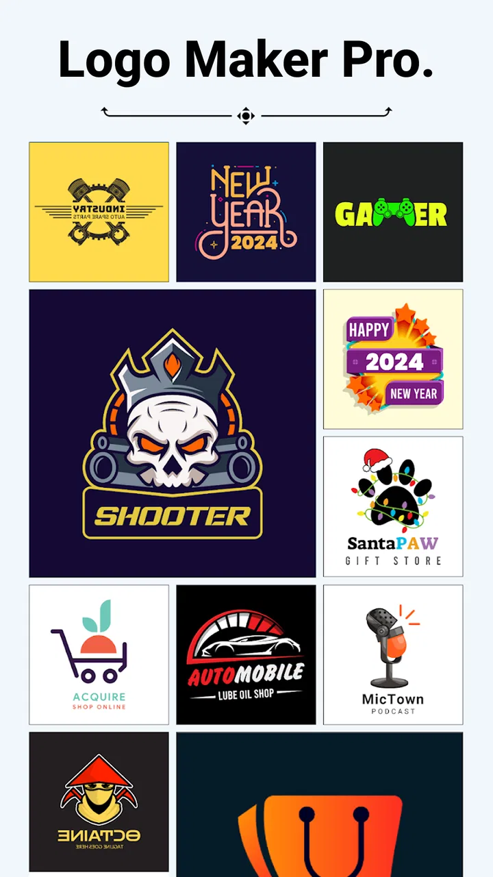
I approached Logo Maker And Logo Creator 3D as a quick design tool rather than a replacement for a full desktop graphics suite. That distinction matters. The app is aimed at people who want to assemble a recognizable logo from ready-made visual material, adjust it on a phone, and leave with something usable without first learning a complicated design program. In my experience, its appeal comes from reducing the blank-page problem: instead of drawing every element yourself, you can begin with a prepared direction and refine it.
Firehawk places the app in the Art & Design category, and the focus is clear from the moment you think about its main job. It combines logo templates, backgrounds, icons, and other graphic elements in one mobile workspace. The store summary points to more than 5,000 of these visual resources, which makes browsing part of the experience rather than a minor extra. The app is free to install, suitable for Everyone, and available on devices running Android 8.0 or later. Optional purchases range from $0.99 to $99.99 per item, so I would treat the free version as a way to test the workflow before committing to anything.
Where the experience can become confusing
The first place I would expect a new user to hesitate is the asset library. A large collection sounds helpful, but it can also make the starting point less obvious. If I open a logo maker with a specific idea in mind, I do not want to scroll aimlessly through unrelated symbols. My practical advice is to decide on the logo’s role before touching the canvas: a shop sign, social profile image, podcast mark, gaming identity, or personal project will each benefit from a different visual weight.
You May Also Like

 Blood Strike: 2.5 Anniversary
Blood Strike’s Loadouts Turn Every Drop Into a Tactical Gamble
A close look at Blood Strike’s custom loadouts: how fast access to signature weapons reshapes its battle royale rhythm, rewards preparation, and narrows the gap between fights.

 Pandora - Music & Podcasts
Pandora’s Music Is Easy to Start, but Harder to Recover
Pandora’s strength is its low-effort path from a seed to a station. Its weak spot is how much confidence it asks you to place in connection, setup, and quiet recovery.

 8 Ball Pool
 Is Built on Rivalries, Rematches, and Routine
A close look at the rivalries, rematches, shared routines, and unanswered safety questions that turn a quick pool match into a persistent mobile community.

 Samsung Music
’s Quiet Strength Is Playing What You Already Own
Its reach comes less from spectacle than from dependable access to a personal library. That simplicity is both the app’s strongest retention engine and its ceiling.

 AccuWeather: Weather Radar
AccuWeather Review: A Quick, Clear Forecast for Everyday Decisions
For everyday plans, the best forecast is the one you can understand quickly. AccuWeather makes rain timing, radar, and local conditions easy to act on, with a few trade-offs.

 Hill Climb Racing
Why Hill Climb Racing Still Turns Crashes Into One More Run
A tiny car, a bumpy hill and one more upgrade: Hill Climb Racing keeps resurfacing because its simple chaos makes every near-miss feel personal.
More From Our News Desk



I also found that the word “3D” can create the wrong expectation. A three-dimensional treatment may make a logo feel more dramatic, but it is not automatically better for every use. Small profile pictures, stamps, app icons, and printed labels often need a simple silhouette that remains readable when reduced. A glossy or dimensional design can look impressive on a phone screen while losing its shape at a smaller size. I would judge the result at the size where people will actually see it, not only while editing.
Another likely sticking point is the difference between choosing an attractive design and creating a consistent identity. The available backgrounds and graphics encourage experimentation, but adding too many effects can make the final mark feel assembled rather than intentional. I get better results when I choose one main symbol, one supporting detail, and a restrained color direction. The app is most useful when I use its library to speed up decisions, not when I treat every available element as something that must appear.
There is also a practical distinction between a logo and a promotional graphic. A logo normally needs to work without a large background, while a social post or banner can use more decoration. If I am preparing a brand mark, I first test it without the background and then with a plain light and dark setting. If it only looks convincing over one decorative background, the problem is probably the design choice rather than the editor.
What I check before starting a design
Before building anything, I make a small list of requirements. I decide whether the design needs to contain a name, an icon, or both; whether it must remain legible in a tiny square; and whether it will be used mainly on a light or dark surface. This takes less time than repeatedly rebuilding a logo after discovering that the lettering is too small or the icon disappears against the background.
I also keep the first attempt deliberately simple. With a library containing thousands of visual options, it is easy to mistake variety for progress. I usually browse several related styles, then return to the strongest two or three instead of endlessly collecting possibilities. This gives me a clearer comparison and reduces the chance of choosing an element merely because it is unusual.
The app is free, which lowers the risk of trying it, but the presence of in-app purchases deserves attention during the browsing stage. I would not assume that every asset or editing option is available without charge. If an item appears locked or a purchase prompt appears, I would decide whether the design still works with the accessible material before investing time in it. That simple check prevents a common frustration: building an entire concept around an element that cannot be used in the version you planned to keep.
Because the current version is 3.0.2, I would also make sure the installed build is current when something behaves unexpectedly. I would not jump straight to blaming the editor if a screen loads slowly, an asset fails to appear, or a saved result seems delayed. First I would close and reopen the app, check the device’s available storage, and try the same action in a simpler project. These are basic checks, but they separate a general device issue from a problem tied to one crowded design.
A steadier workflow for building a logo
My preferred workflow starts with the symbol, not the background. I browse for an icon or base style that communicates the subject quickly, place the name afterward, and only then consider decorative treatment. This order helps because the central idea remains visible throughout the process. If I begin with a dramatic background, I can end up adjusting every later choice to match it, even when the background is not helping the identity.
Once the main elements are in place, I check spacing before color. A logo can survive a modest color change more easily than cramped lettering or an icon that sits too close to the edge. I look at the empty space around each element and try to keep the visual center stable. On a phone, small alignment differences are easy to overlook while zoomed in, so I repeatedly step back and inspect the full composition.
One useful habit is to create a deliberately plain version before adding effects. I make the mark readable with a basic background and limited styling, then compare it with the more polished version. If the decorated result is less clear, I remove effects rather than adding more. This is one of the strongest ways to use a template-based editor: let the prepared assets provide a starting structure, but keep the final decision under your control.
I would also avoid changing several variables at once. If I replace the icon, font treatment, background, and color in one pass, I cannot tell which change improved the result. Instead, I adjust one area, inspect the full logo, and then continue. That may sound slower, but it is faster than losing a good direction inside a series of random edits.
For a small business, a useful test is to place the finished mark beside the business name in a plain note or mock sign. I ask whether the logo still feels connected to the name when separated from the editor’s presentation. For a personal project, I test it as a small avatar and as a larger image. These two situations reveal different weaknesses: tiny use exposes clutter, while large use exposes awkward spacing and low-quality-looking effects.
How I recover when a project goes off track
When a design starts looking messy, I do not immediately rebuild from zero. I first identify the last decision that clearly made it worse. If the composition was balanced before adding a background, I remove or replace that background. If the lettering became difficult to read after an effect was applied, I return to a simpler treatment. This kind of rollback is more reliable than trying to repair several overlapping choices at once.
If an asset does not appear as expected, I repeat the action in a new, minimal project. I use one icon and one text element rather than testing inside a busy composition. If the simple project works, the original issue may be related to the particular design or a crowded editing state. If the same problem continues, restarting the app and checking the device are sensible next steps. I would also avoid repeatedly tapping a purchase or confirmation control while a screen is still responding, since that can make the situation harder to understand.
Saving intermediate versions is another practical safeguard. I keep a basic composition before experimenting with effects, then make changes from that point. This gives me a clean fallback and makes comparison easier. It is especially helpful when I am trying several visual directions for the same name. Rather than expecting one project to hold every experiment neatly, I treat each version as a separate decision.
If the final image looks different from the editor, I compare it at the same scale and against the same background. A design can appear stronger inside a colorful workspace than in a plain gallery view. I also check whether the issue is actually contrast: a subtle outline or shadow may disappear on a similar-colored surface even though it looked visible during editing. The fix is usually to simplify the contrast, not to add another decorative layer.
When the app is not the real problem
Some disappointments come from choosing the wrong tool for the intended job. This app is a convenient starting point for quick logo concepts, but I would not use it as my only tool for detailed vector construction, complex brand systems, or exact production specifications. If I need precise paths, carefully controlled typography, or a logo that must be edited extensively across many formats, a dedicated vector editor is the better choice.
It is also not the best fit for someone who already has a finished identity and only needs tiny technical adjustments. In that situation, importing an existing working file into a specialized editor may be less frustrating than recreating the design from templates and icons. Likewise, a person who wants to draw every shape from scratch may feel constrained by a library-centered workflow. The strength here is speed through prepared material, not unlimited manual construction.
On the other hand, I think it suits beginners, side-project owners, students, club organizers, and anyone who needs a respectable first concept without opening a desktop program. A café owner preparing a temporary social profile, for example, could choose a simple food-related symbol, add the name, test it against light and dark backgrounds, and produce a usable starting identity during a short break. The important word is “starting.” I would use that result to clarify the direction, then refine it further if the brand becomes more serious.
The audience size suggests that the app has broad appeal: it carries an average rating of 4.8 from around 59 thousand ratings and has passed 5 million installs. Those figures make it easier for me to recommend trying, but they do not remove the need for personal testing. A highly rated template tool can still be a poor match if its visual style does not fit your subject or if you need more control than prepared assets allow.
What I would decide before paying
I would spend time testing the free path with a complete small project before considering an optional purchase. The question is not simply whether a premium-looking asset is attractive. I would ask whether it solves a specific problem in my design, such as improving recognition, balancing the composition, or making the mark more suitable for its intended background. If it only adds decoration, I would keep the simpler version.
I would also compare the result with a plain text-and-symbol version. This is a useful trade-off because a more elaborate logo may look more finished, while the restrained version may be easier to remember and reproduce. If the two designs communicate the same idea, I prefer the one that remains clear at a small size and does not depend on a busy background.
Since purchases can reach $99.99 per item, I would be particularly careful with impulse decisions. I would not buy several assets merely because browsing makes them feel connected. I would first settle the concept, confirm that the chosen direction works, and then decide whether a paid element genuinely improves it. That approach keeps the app’s convenience from turning into an expensive collection of unused possibilities.
My practical verdict for everyday use
I came away viewing this as a fast, approachable mobile logo workshop. Firehawk has made the experience accessible to people who want to move from idea to visual draft without mastering professional design software. The combination of templates, icons, backgrounds, and other graphics gives me enough material to explore several directions quickly, while the free entry point makes experimentation reasonable.
Its main weakness is the same thing that makes it attractive: a large selection can encourage unfocused browsing, and prepared visual effects can tempt users to over-design. The best results come from entering with a clear purpose, building around one strong symbol, checking readability away from the editor, and keeping a simpler fallback version. I would also remember that a logo made quickly is not necessarily a finished brand identity.
For a beginner or someone needing a quick concept on Android, I would recommend trying it. It is especially practical for a small project, a temporary identity, or an early visual draft that needs to be produced without a desktop workflow. I would skip it if I needed precise vector control, extensive manual drawing, or a fully managed professional identity system from the start.
Overall, Logo Maker And Logo Creator 3D earns its place as a convenient first step rather than an all-purpose design studio. I like it most when I use its library to overcome a blank canvas, then apply my own restraint and judgment. If you approach it that way, the app can turn a vague idea into a clear logo direction quickly, while still leaving room to move to a more specialized tool when the project grows.
FAQs for Logo Maker And Logo Creator 3D
01What features does Logo Maker And Logo Creator 3D offer?
Logo Maker And Logo Creator 3D provides a comprehensive suite of tools for creating unique and professional logos. Users can access a vast library of templates, icons, and fonts. The app also features a 3D logo creation tool, allowing for more dynamic and visually appealing designs, perfect for businesses or personal branding.
02Is Logo Maker And Logo Creator 3D user-friendly for beginners?
Yes, the app is designed with user-friendliness in mind, making it accessible for both beginners and experienced designers. It features an intuitive interface with easy-to-follow instructions. Tutorials and tips are integrated to guide users in creating stunning logos efficiently, without needing prior design experience.
03Are there any costs associated with using Logo Maker And Logo Creator 3D?
Logo Maker And Logo Creator 3D offers a free version with basic features and templates. However, for advanced functionalities, including premium templates, fonts, and the 3D logo creator, users can opt for in-app purchases or a subscription model. This allows users to choose based on their specific needs and budget.
04Can I export my designs in high resolution with Logo Maker And Logo Creator 3D?
Yes, the app allows users to export their creations in high resolution. This feature ensures that logos maintain their quality across various platforms and mediums, including digital and print. Users can choose from different formats, ensuring compatibility with their intended use cases.
05Does Logo Maker And Logo Creator 3D support cross-platform usage?
Currently, Logo Maker And Logo Creator 3D is available for both Android and iOS devices, allowing for cross-platform usage. However, design projects are typically saved locally on the device. Users should ensure they back up their designs to cloud services or external storage for access across different devices.
Pros
- Easy-to-use interface for quick logo creation.
- Wide variety of templates and design options.
- 3D effects add a professional touch.
- Supports high-resolution exports.
- Frequent updates with new features.
Cons
- Some features require in-app purchases.
- Limited free template options available.
- Occasional ads can be intrusive.
- 3D rendering can be slow on older devices.
- Limited color customization in free version.

Logo Maker And Logo Creator 3D
Gallery